BRIEF
Design an art cover, labels & a poster, based on the given design brief related to a music band of your choice.
Your selection might reflect something interesting in terms of ‘aesthetics/characteristics’ within the genre, pulling out maximum of design issues based on codes/visual language of the genre, to develop a relevant work of design and being creative in a mixed-media completion [i.e.K2 Consumer Catalogue].
To be clearer, don’t select any K Pop, V Pop, any Boy’s or Girl’s band because here you won’t learn much from a historical approach of music/genre and design relationship. But some music movements like electronic music, rock, heavy metal, punk, rap, hip-hop, jazz, folk music, classical music, etc. are very interesting in terms of researching and getting knowledge out of it, because of their total connection within the design field and the visual creation.
Your overall design development (elements, typography and colors) should reflect clearly on the content of the design brief to develop a Vinyl-based Packaging product with bonus as a design doc, a typographic poster of yours.
Print submission: A0 sheet with the cover, poster and label. Extra for bleed defined in the document prepared templates.
Digital submission through iMAC Oanh’s office: Adobe Illustrator / Photoshop working file (no flatten image). One JPEG (72dpi) file of the lay-out for marking preview purposes. The main work as a 300dpi pdf document based on the main template as provided.
No Images from the band or related to the band/singer/artist universe etc. as to be used, even the photo of the band etc. Here you are going to develop a specific design for the album based on the following brief.
Contents for the Art & Label and Poster.
A – related to the main Cover Art [Vinyl gatefold]
- You are going to use the original album title & tracks list from a ‘real’ album of your selected band.
- Use all information, you can find on your band’s album. [Recording Label Logo, bar code, all info featuring on the Album Packaging, …
- Practical approach Since this is a cover art. You need to communicate the content of it clearly. Sketch out thumbnails to get some ideas rolling before working on the computer. Stylized photographs or/and apply illustration but keep the style and title consistent through out the cover, spine, poster and labels. You can use cut and paste methods, scanned self-drawings, Photoshop collages, vector graphics, etc. but you have to demonstrate what we have learned so far in this ongoing semester and you must use the techniques covered in class during the exercises.
- Setting up your layout
A template has been prepared in the main folder. You have to set up the print’s marks, manually. Another document has been placed in the Vinyl Templates folder called RecycledJacketSpecs.pdf. Get the marks from it to then laying-out the main template called 12inJacket+3panelsPoster+labels.ai
- References from the library and the Web
as seen in class while discussing about WHITHIN THE GENRE and to discover Codes and Language of GENRES:
- http://www.raster-noton.net/
- editionsmego.com/
- http://www.mille-plateaux.net/
- http://www.lineimprint.com/shop/
- http://dubrussell.com/releases/2011/05/15/420/ http://dubrussell.com/
http://shoheitsuda.net/adustiehohs/
Book RMIT Bean Library:
Grid index / Carsten Nicolai. Aka Alva Noto or Noto – Raster Noton Label Nicolai, Carsten, 1965- Berlin : Gestalten, 2009. 1 v. (unpaged) : all ill. ; 24 cm. + 1 CD-ROM (4 3/4 in.)
+++++++++++++++++++++++++++++++++++++++++
Dataphonics / Ryoji Ikeda. Imprint: Paris : Dis voir, 2010. Collation: 1 v. (unpaged) : chiefly ill. ; 22 cm. + 1 sound disc (digital ; 4 3/4 in.) Notes: Accompanying compact disc has catalog number: 133938 ZiaZig004. ISBN: 9782914563512 Dewey Class: 780 Language: English
- Naming Convention
The Illustrator and Photoshop files should be included into a folder, without flatten image but all separated individual layers, following the file-naming protocol for the assignment as below: G#_s#_A2 on the back of the print. G#_s#_A2 on the folder
Files submitted that are named in any other way will NOT be assessed.
- General Guidelines
Remember that the general rules regarding plagiarism, intellectual property rights, file naming, University-standard English and deadlines are all in force for all assignments in all B. Design courses.
You are expected to cite and reference properly. Words that are not yours should be placed in quotes and accompanied by an inline citation as well as a reference at the end of the paper. Paraphrases or general ideas not belonging to you should also be indicated with an inline citation and a reference.
- Late submission
A maximum of 3 days is allowed for late submissions.10% will be deducted per day. After 3 days a ZERO will be provided. This course does not collect assignments on Saturday and Sunday.
/////////////////////////////////////////////// ////////////////// ////////////////////////////////
Design Brief:
- You are to create/renew a special typographic logo for the main Band Name.
- The Album Cover will show on:
- The frontside panel, a pattern-based image creation or a geometrical vector-based design + combined with a photograph (free of copyrights), within a specific color scheme of your choice with a realistic rendering about lightning and perspective to create Depth. You have to develop it, to show clearly the difference among the main foreground, middle-ground and background. The Band name only, must occur on this panel.
- The backside panel should be whatever image creation that can suite well as an extension of the frontside cover + textual information (tracks list, recording label logo, website url, …)
- The Cover spines should say the band name and album name and also the recording label.
- A poster will be inserted into the main jacket. The poster has to be formatted as a portrait format. This poster has to be developed within an Experimental Typographic poster rendering by displaying the main title of each soundtrack within an interesting visual rhythm or you can have another option as, within an ISOMETRIC Typographic poster rendering.
The main aesthetic direction is up to you, but it needs to get an interesting visual impact to be considered as a typographic poster within a color scheme of your choice. Be creative!
- For the vinyl labels, the main creative direction is up to you but it should fit with the other designs and it should say A for ‘Side A’ and B for ‘Side B’. Color scheme of your choice.
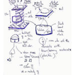
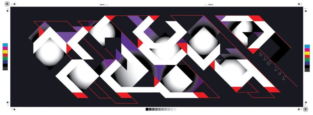
- As shown below, (Illustrator Screen Print Image) you have to develop your layout based on the rules of geometry, as show here, the easiest one is the Rule of Third. I did let appear the grid + ruler guides + red squares (own system) to lay out everything under-control based on the element own relationship. DO the same, within your Illustrator or Photoshop file, let appear such hierarchy in construction by displaying in a good organization (layers + renamed) all the main construction from within the system of your choice (typo systems, geometrical figures, rule of third, golden rectangle, ratio/multiple…). Write a DOCX word file, as a reflective document whereas you are justifying about your construction and design lay-out and alignment. PASTE an image as shown below to let appear those construction lines into this DOCX.
WORK
I applied the rule of third in most of my design. Furthermore, I developed my own rule by adding more line, which separates 2/3 of the square. The colour scheme that I use was Analogous, which is between red, pink purple, and blue. The reason I used these colours is that fit in the music genre.


Firstly, the band name has been manipulated and develop throughout the process to make it more legible. The manipulation was based on the basic geometric shape, rule of third composition and grid system.

I made 45 degrees lines and crossed them together to make my grid system. Therefore, I could placed my elements more accuracy. I use colours to make the cover more depth. The radical paint had been selected to achieved my design. Furthermore, in the background, I also paint shadow for the text and the shadow enhances more depth.


The logotype of the band is also the album cover so that people can recognise it easily because of the unusual shape.
In the back cover, I used lines and type as my elements. I used lines as the element of design and also it leaved more whitespace. vertical and horizontal line was crossing each other to make the Christian symbolic, which is fit in the band’s website. Line was also powerful because it keep the constancy, which is the continuity from the front to the back album cover. Furthermore, lines were also based on the axil system and rule of third. Text were readable and fit in the requirement.
Secondly, I develop my own typeface to fit in the album. The technique that i used in the album cover was the same at the poster, however I had developed it efficiently. The radical paint tool is to fill in the body of the character, drop shadow on the purple background to create more depth.
I combined Experimental Typography within Isometric typographic in my design. To make it more abstract, I combine 2 characters with the same shape together. For example: “W” and “M”, “A” and “V”, “O” and “D”. The every first letter of the song title was selected to displace as the typography poster. I created the rhythm of the typography poster by repeating the “V” shape in my whole design. I arrange them together in the axial system, which is horizontal and 45 degrees. There are may elements in my poster design, so that I decided to leave more whitespace at the top and bottom of the poster and added the band name in the end.

Thirdly, I applied basic shape – triangle – and rule of third in my CD vinyl. I used contrast between white and dark blue to highlighted the name side A and side B. Furthermore, I add more red and purple in the vinyl to make the consistency of my whole design. The text were the same as the typeface that I had use in the Album Cover.